


CSS Online Image Filter – Change Color Picture at CSS3
- JPG
- head
CSS filter: ALL
Online generate params for CSS property filter
Visual demonstration work css property "filter". Left and Right column include ten filter params.
Image Formats* - format main image.
Include type* - method include CSS property filter.
All Filters - setup all params concurrently.
RESET - clear all params.
* - Will add new value and opportunity choise.
Common data about CSS property FILTER
CSS Filter change color gamma image or block on based image filters, sample - sepia, brightness, blur and other. Property Filter was add in CSS specification recently (first description - 25 october 2012). Internet Explorer not supported CSS Filter.
List browser support property Filter
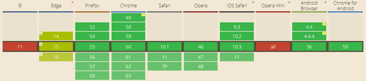
- IE not supported - Microsoft Library.
- Edge - not supported url
- Chrome version 58 - 49 and Android Browser in Android 4.4 and 4.4.4 required add prefix "-webkit-".
Description parameters for property Filter
BLUR
Possible value: lenght (px,rem,vw,vh и т.д.).
Range of values: 0 - ∞; base value: 0 (base value - value wich image original).
Description: Blur this defocusing image. Warning - big params (over 100px) can reduse perfomance. Big params make image may be clode to monotone.
Sample: filter: blur(10px);
BRIGHTNESS
Possible value: float, percent.
Range of values: 0 - ∞, 0%-∞%; base value: 1 or 100%.
Description: Increase and decrease brightness. 0 - image fill black color. 1 or 100% - original color, more 100% increase brighness.
Sample: filter: brightness(0.2);
CONTRAST
Possible value: float, percent.
Range of values: 0 - ∞, 0%-∞%; base value: 1 or 100%.
Description: Increase and decrease contrast.
Sample: filter: contrast(200%);
DROP-SHADOW - Тень
Possible value: lenght and color shadow.
Range of values: first and two params - lenght offset, any number; 0 - ∞, for thred params - blur, if "0" this no blur shadow.
Description: Shadow for image get after set next params: 1 offset X, 2 - offset Y, 3 - shadow blur, 4 - color shadow. Color shadow not required params for some browser (for example chrome set default color #1a1a1a). CSS Filter "drop-shadow" similar CSS 'box-shadow' property.
Sample: filter: drop-shadow(20px -20px 10px #000);
GRAYSCALE
Possible value: float, percent.
Range of values: 0 - 1, 0%-100%; base value: 0;
Description: Decrease color image
Sample: filter: grayscale(0.2);
HUE-ROTATE
Possible value: angle (deg, rad)
Range of values: any number; base value: 0 or 360deg.
Description: filter based on offset value to color circle. Example - original blue will be replaced to light green when offset 90 degree and yellow when offset 180deg.
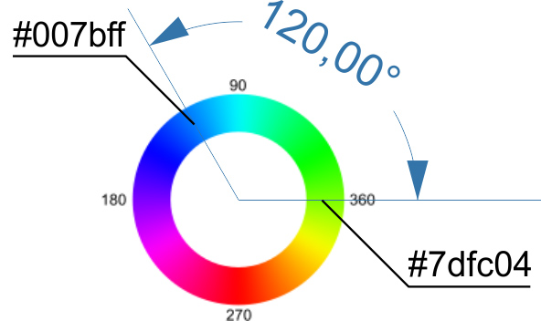
result color #007bff will be replaced to #7dfc04
Sample: filter: hue-rotate(180deg);
INVERT
Possible value: float, percent.
Range of values: 0 - 1, 0%-100%; base value: 0.
Description: Invert color (example - black replaced white), 0 - original image, 1 or 100% full invert. Middle invert (0.5 или 50%) image fill grey.
Sample: filter: invert(90%);
Opacity
Possible value: float, percent.
Range of values: 0 - 1, 0%-100%; base value: 1 or 100%.
Description: Opacity.
Sample: filter: opacity(0.7);
Saturate
Possible value: float, percent.
Range of values: 0 - ∞, 0%-∞%; base value: 1 or 100%.
Description: Increase and decrease saturate.
Sample: filter: saturate(0.7);
SEPIA
Possible value: float, percent.
Range of values: 0 - 1, 0%-100%; base value: 0.
Description: Effect of agging in old photo. When value 100% or 1 - in image will be used only reddish-brown color.
Sample: filter: sepia(100%);
Links:
- Specifications - https://www.w3.org/TR/filter-effects/
- Descriptions - https://drafts.fxtf.org/filter-effects/
- Browser supported - http://caniuse.com/#feat=css-filters
- Mozila Web docs - https://developer.mozilla.org/en/docs/Web/CSS/filter
 (4 votes, average: 10.00 out of 10)
 Loading...
